Behind the Docs: How UX Shapes Our New Developer Experience
June 3, 2025

How we redesigned developer documentation information architecture for a unified, seamless experience
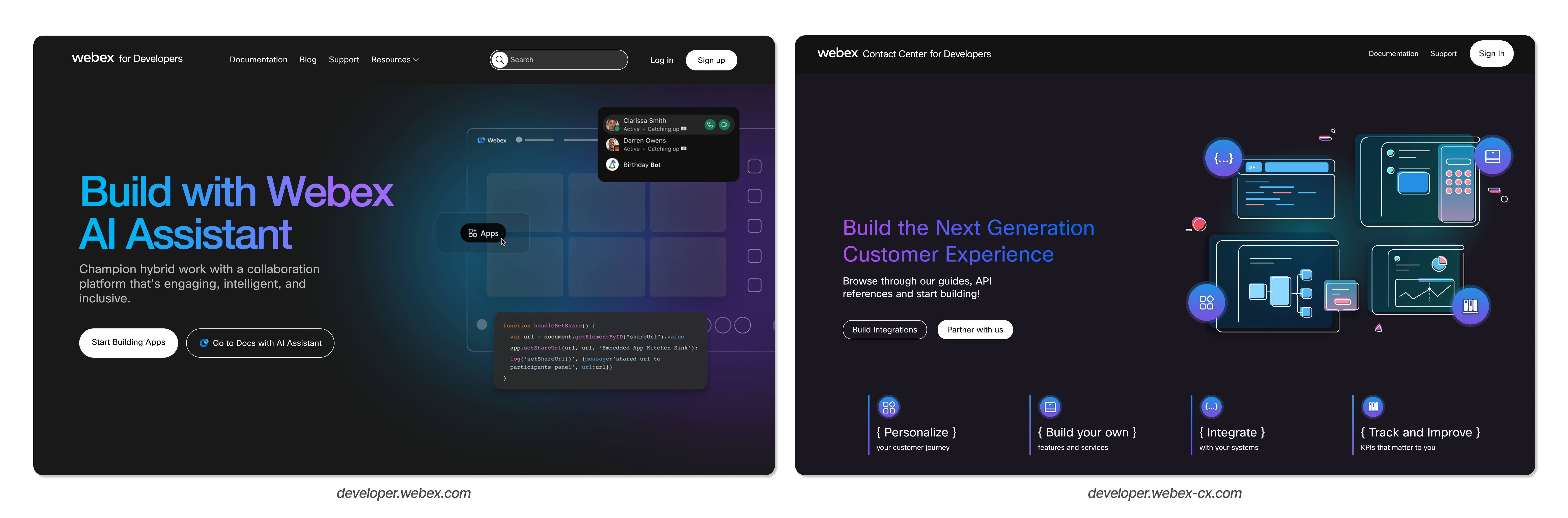
At Webex by Cisco, we know that clear, intuitive documentation is essential for empowering our developer community - we want to make it easy for you to build with us! With that in mind, we’ve just rolled out a major update to our developer documentation. We’ve combined the Webex Contact Center and Webex Suite developer docs into one site and reimagined the navigational experience from the ground up - focusing on discoverability, scalability, and taxonomy, all while creating a seamless, user-first experience.
The Challenge: Separate Experiences
Previously, we had separate websites for developers building with the Webex Contact Center and Webex Suite products. While each site offered valuable content, the flat navigational structure across two platforms made it harder to stay oriented. Whether searching for an API reference, trying to understand how different features or systems interact, or looking for an educational webinar or blog, developers and admins often had to jump between product areas and sites - potentially disrupting the all-important flow state.
As more of our customers adopt the full Webex platform - including both Contact Center and Suite - we’re meeting you where you are. By bringing everything together in one place, we’ve reduced friction and empowered you to build more with Webex, making it easier to find what you need, stay focused, move faster, and remain in flow.
Our UX Approach: Principles and Process
1. Findability
One of our core goals was to make key tasks and topics easier to find. As part of that effort, we invited our developer community to take part in early feedback and our Webex Developer Beta Program. While participation was limited, the insights we gathered - along with our own usability testing - revealed that important content was often buried too deep or grouped in unintuitive ways. So we made some meaningful changes:
- Restructured content to better reflect how developers and admins actually work - and how our products work together
- Updated labels and categories for consistency, clarity, and scanability
- Simplified navigation to help you reach essential info faster
Card sorting played a crucial role in shaping our new groupings, and the result is a system that’s easier to browse at a glance, and faster to search through with intent.
Now that we’re live, we’ve already received valuable feedback from the community and we’ve heard you. Based on that input, one of our next iterations will include adding an “All APIs” list. We’re also actively working to get search back up and running as soon as possible.
2. Scalability
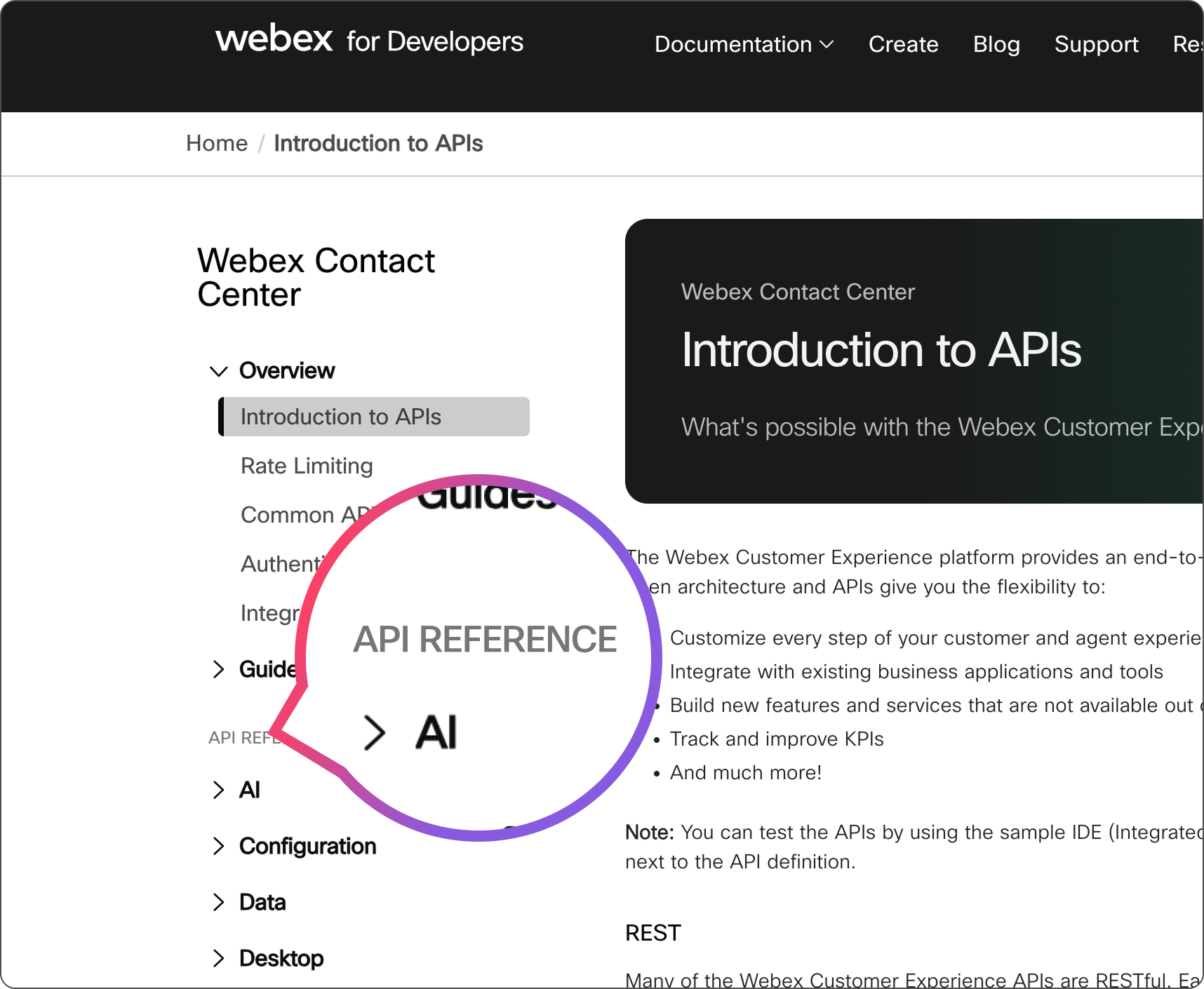
As we integrated both the Suite and Contact Center docs, we also kept future growth in mind. We needed a flexible structure that could accommodate new products and features without becoming cluttered or overly complex. By eliminating deep, inconsistent nesting
 and creating clear, concise categories, we laid the groundwork for a scalable system. Each category was designed to grow organically, allowing us to add new documentation without requiring another structural overhaul. For example, in the global navigation, you can now find high-level groupings that address specific areas of our product suite such as Meetings, Contact Center, Devices, and more.
This approach not only supports what we offer today but also prepares us for long-term expansion.
3. Harmonious Taxonomy
Perhaps the most important aspect of this redesign was the unification of language and taxonomy, specifically within the left navigation. Labeling inconsistencies, like some overview pages being labeled “Overview” and others “Introduction”, created unnecessary cognitive load for developers and admins navigating between the Suite and Contact Center docs. It’s not something we often consider consciously, but having to stop a flow to think through inconsistencies like this really adds up over time.
Through cross-team collaboration and user research, we developed a unified vocabulary for the left navigation ensuring that labels and categories were consistent, clear, and intuitive across both the Suite and Contact Center docs. While this improvement has greatly enhanced navigation clarity for external users, it also delivered a significant internal benefit: it helped us align on consistent naming conventions for the structure of our information. By codifying levels such as Level 1: Global Navigation, Level 2: Secondary Navigation, Level 3: Parent Page, and Level 4: Child Page, etc. we created a shared language that makes it easier for cross-functional teams to collaborate and communicate clearly. This alignment ensures that when we talk about structure, we’re all speaking the same language both internally and externally.
We continue to refine the overall vocabulary across the entire site and product suite - an effort that spans many different engineering teams. This shared language not only supports a more unified experience for users, but also sets a consistent standard internally as our platform grows.
Accessibility from the Start
As part of this work, we partnered closely with our accessibility team to better understand how our documentation experience could support all users. Through user research and an accessibility-focused study, we identified key areas for improvement - particularly around tab order, screen reader clarity, and overall navigability.
In this first release,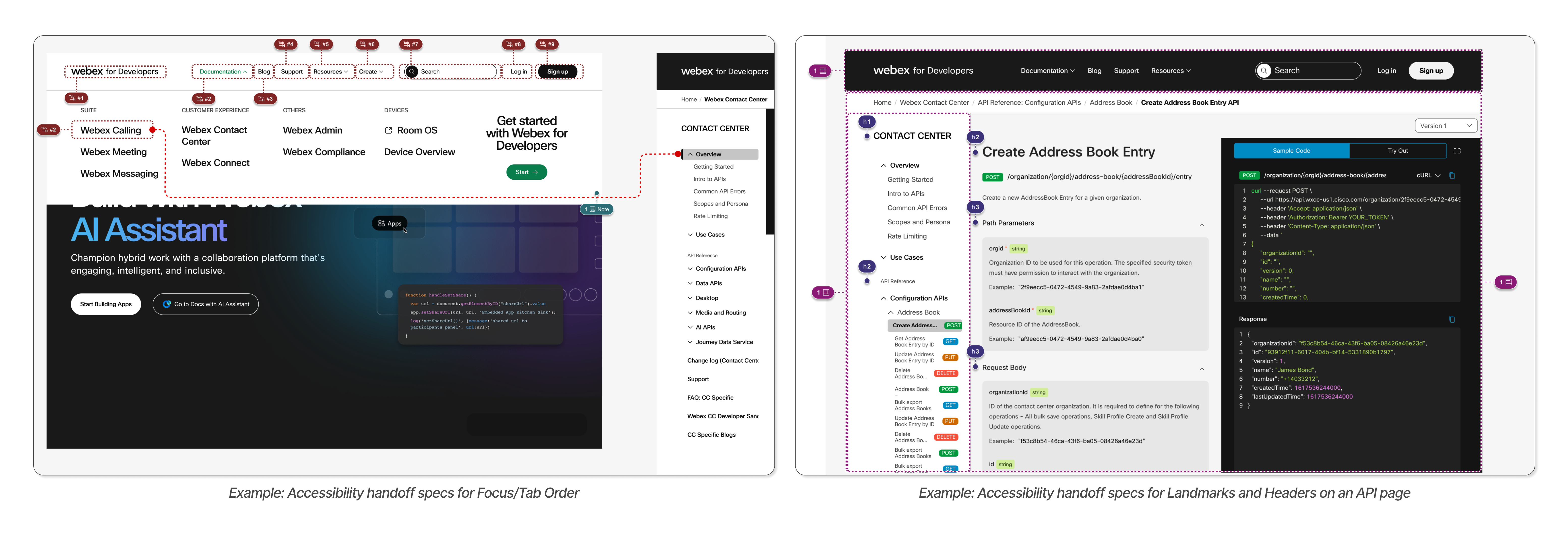 we’ve addressed several of these issues, including improved keyboard navigation and ensuring that all navigation elements are clearly labeled for assistive technologies. Accessibility is a long-term commitment, and we’ll continue rolling out additional improvements in future iterations to ensure our documentation is inclusive and usable for everyone.
What’s New in the Experience
With these foundational changes in place, the new experience brings together documentation for both the Suite and Contact Center under a single navigation system. No more bouncing between separate sites - everything now lives under one roof with a clean, unified structure.
- We’ve simplified and renamed categories to make it easier to locate
what you need without digging through layers of menus. Look for the
API Reference section to find a list of all APIs related to each
product.
- Frequently used resources are now easier to access. For example, your
access token and Org ID are located in the user profile
dropdown-available at any point in your journey, no matter where you
are on the site. We’ve also heard your feedback about needing to
re-copy the access token, and we’re actively working on a fix to make
that experience smoother.

- You’ll also now find documentation for all three of our API types in one place: REST (used by most of our Suite features), GraphQL (used for WxCC Search), and gRPC (used for additional WxCC capabilities).
- Landing pages across the site have been, and continue to be,
refreshed with clearer overviews, direct access to key APIs and
guides, and step-by-step getting started flows to help users orient
quickly.
What This Means for You
These changes translate directly into a better day-to-day experience. You’ll get faster time to value, with less time spent figuring out where things are and more time doing meaningful work. A consistent structure and language help you navigate seamlessly between product areas, reducing confusion and improving efficiency. The new information architecture is designed to scale as we do, without adding clutter or complexity. Whether you're a developer implementing a feature or an admin configuring settings, you'll find what you need faster and in a more familiar format.
What’s Next
This launch is just the beginning. We’re already working on the next wave of improvements, including enhancing our overview pages with easy-to-follow, step-by-step guides, expanding content across additional products and advanced use cases, and implementing search behavior to be even more contextual and accurate (think AI Assistant). We’ll also continue our accessibility work - especially on mobile and dynamic elements - and longer term, we’re focusing on better onboarding experiences for both developers and admins.
Looking further ahead, we’re exploring ways to make our documentation more interactive and responsive to your needs - think building in-line within the context of our documentation with our AI assistant, helping you complete tasks, answer questions, and move faster without leaving the page.
As always, we’re building in the open, and your feedback helps us make it better. If you have suggestions or spot something we’ve missed, reach out to our developer support team. You can also help shape future features and experiences by joining the Webex Developer Beta program. This is your documentation too.